UI design · Live · September 2026
Linkiln LUMS
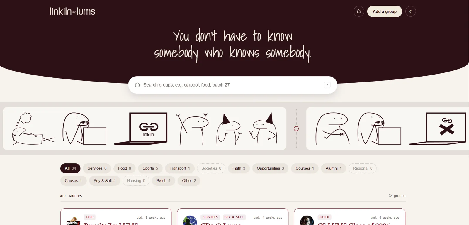
You don’t have to know somebody who knows somebody. A directory with one job: find a student group and join it in under thirty seconds.
- 6pages designed and built
- 19illustrations drawn
- 30 sfrom search to joined
The problem
At LUMS, getting into the right WhatsApp group (a society, a carpool, a batch group, a food service) meant asking around, digging through screenshots, and hoping someone’s invite link hadn’t expired.
What I designed
Six pages: the board, a group’s page, a four-step “add a group” flow, an edit gate, an editor, and reporting. One flow matters more than everything else: find a group, then join it.
Search first
The search bar breaks out of the content width so it spans the screen, and its placeholder teaches the vocabulary: “carpool, food, batch 27”. Category pills show live counts, and empty categories are drawn as dashed outlines instead of solid pills, so you can see they exist without being led into a dead end.
One card, everywhere
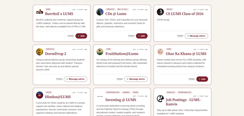
The group card is a single component, reused as the live preview on the add page, so whoever submits a group sees exactly what students will see.
A visual system that feels student-made
A handwritten face carries the hero promise and a serif keeps everything else readable: the handwriting makes it feel made by students, for students. I drew the nineteen illustrations in the looping story strip, four little stories that scroll past the search bar. The strip pauses on hover and switches off entirely for anyone who has reduced motion turned on.
The light and dark themes were designed separately rather than inverted, each with its own surfaces, inks and accents.
Honest by default
Say what is not connected, rather than faking it.A principle from my rebuild notes
When the email service didn’t exist yet, the verification screen said plainly that nothing had been sent, instead of showing a fake success. Every interactive element has a visible focus ring, form inputs stay at 16px so iPhones don’t zoom on tap, and the six-digit code accepts a paste of the whole code at once.